Mixing patterns in interior design is a simple way to add personality, depth, and visual interest to a room. However, combining different prints can quickly make a space feel cluttered if the colors, sizes, and styles compete with one another. The key is not to find patterns that look identical, but to understand how they relate. With a consistent color palette, varied scales, and a balance between bold and subtle designs, you can combine florals, stripes, geometric prints, and organic motifs to create a room that feels cohesive rather than chaotic.
1. Understand Different Types of Patterns
Before combining patterns, it helps to recognize their visual characteristics. Different pattern families create different effects, and understanding these differences makes it easier to choose combinations that complement one another.
-
Geometric patterns: Squares, diamonds, triangles, grids, and repeating lines create structure. They work particularly well in modern, contemporary, and minimalist interiors.
-
Floral and botanical patterns: Flowers, leaves, branches, and vines introduce softness and natural movement. They are common in traditional, cottage, and eclectic spaces.
-
Organic patterns: Irregular shapes inspired by nature, such as waves, wood grain, stone, and flowing lines, create a relaxed and less structured appearance.
-
Stripes and checks: These classic patterns provide visual rhythm. Stripes can make a room feel more directional, while checks introduce a balanced, orderly effect.
-
Abstract patterns: Irregular shapes, expressive brushstrokes, and artistic compositions add energy without following a strict repeating structure.
-
Animal prints: Leopard, zebra, and other animal-inspired designs can act as bold accents, particularly when used in small quantities.
You do not need to include every pattern type in one room. Choosing two or three complementary categories is usually enough to create variety while keeping the overall design controlled.
Identifying visual traits across geometric, floral, organic, and striped motifs to build complementary pairings
2. Seven Rules for Mixing Patterns Successfully
Start with a Cohesive Color Palette
Color is one of the strongest connections between different patterns. Even when two prints have completely different shapes, they can look coordinated if they share a few colors.
Begin with a palette of three to five colors. Choose one dominant shade, one or two supporting colors, and a small number of accent tones. For example, a room built around navy, cream, and muted terracotta could combine a navy-and-white striped rug, cream floral cushions, and a terracotta geometric throw.
The colors do not need to appear in equal proportions. Repeating one shade in different patterns is often enough to make the combination feel intentional.
Unifying contrasting prints effortlessly by anchoring your room around three to five shared colors
Vary the Scale of Each Pattern
Pattern scale refers to the size of the shapes or motifs within a design. One of the most effective ways to combine prints is to use different scales rather than choosing several patterns with similarly sized details.
A practical combination includes:
-
One large-scale pattern as the main visual feature.
-
One medium-scale pattern to connect the larger design with smaller details.
-
One small-scale pattern to add subtle texture without demanding too much attention.
For example, pair a large floral wallpaper with medium-sized striped curtains and small geometric cushions. The differences in scale help each pattern remain distinguishable.
Preventing visual clutter by balancing one large focal print with medium and small-scale accents
Balance Bold and Subtle Designs
Not every pattern should compete for attention. If a room contains several strong prints, the overall effect can become overwhelming.
Choose one pattern to act as the focal point. This could be a statement rug, patterned wallpaper, or an upholstered sofa. Let the other patterns play supporting roles through smaller accessories, bedding, or window treatments.
If your main pattern is colorful and visually complex, use simpler designs around it. Conversely, a room with understated geometric patterns can accommodate a more expressive accent print.
Combine Organic and Geometric Patterns
Organic and geometric patterns often work well together because they provide contrast. Geometric designs introduce order and repetition, while organic motifs bring movement and softness.
For example, combine a structured grid-patterned rug with botanical cushions, or place abstract artwork against wallpaper featuring fine geometric lines. The contrast prevents the room from looking too uniform.
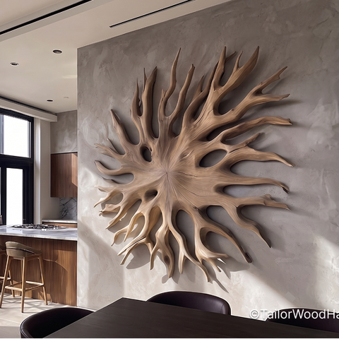
Natural materials can strengthen this combination. Textured wood surfaces, woven accessories, and sculptural decorations introduce additional visual variation without requiring another bold print. Handcrafted carved wood wall art can complement patterned interiors by adding dimension and natural texture to otherwise flat surfaces.
Pairing structured grid lines with flowing botanicals and dimensional carved wood wall art for rich contrast
Repeat Colors Throughout the Room
A pattern combination becomes more cohesive when its colors appear in multiple places. If your curtains contain sage green, repeat that shade in a cushion, decorative object, or piece of artwork.
This technique creates visual continuity between different surfaces. It also helps prevent individual patterns from looking like unrelated additions.
You do not need to repeat every color everywhere. Focus on one or two recognizable shades and distribute them naturally throughout the room.
Use Solid Colors as Visual Breaks
Solid-colored surfaces give the eye somewhere to rest. Without them, patterns can compete across every available surface, making a room feel crowded.
Introduce plain upholstery, neutral walls, solid curtains, or simple bedding between patterned elements. For example, if your sofa has patterned cushions and the floor features a decorative rug, a plain sofa cover or neutral wall can help balance the composition.
Negative space matters just as much as the patterns themselves. A room does not need a print on every surface to feel visually interesting.
Consider Texture Alongside Pattern
Pattern and texture are different, but they influence one another. A smooth fabric with a printed design creates a different effect from a woven textile with a raised or irregular surface.
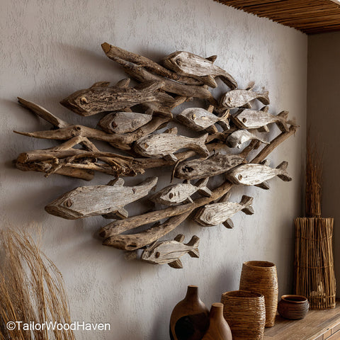
Combining materials such as linen, wool, cotton, rattan, and natural wood adds depth without introducing too many competing colors. In coastal or nature-inspired interiors, driftwood wall art can introduce irregular organic forms that complement botanical prints, flowing lines, and textured fabrics.
The goal is to create contrast through both appearance and material, rather than relying entirely on printed patterns.
Layering woven linen, natural wood grain, and organic driftwood wall art to add depth beyond flat prints
3. Pattern Combinations That Work Well Together
Some pattern pairings are particularly easy to use because they balance structure, movement, and visual weight.
|
Pattern combination
|
Why it works
|
Where to use it
|
|
Stripes + florals
|
Stripes provide structure while florals soften the look
|
Bedrooms, living rooms
|
|
Geometric + organic
|
Regular shapes contrast with natural, irregular forms
|
Modern and contemporary spaces
|
|
Checks + stripes
|
Repetition creates rhythm when the scales differ
|
Kitchens, casual dining areas
|
|
Floral + botanical
|
Shared natural inspiration creates a layered look
|
Traditional and cottage interiors
|
|
Abstract + geometric
|
Expressive shapes balance structured lines
|
Modern and eclectic rooms
|
When using these combinations, avoid selecting patterns that have identical visual weight. A large, colorful floral print paired with a smaller, restrained stripe is generally easier to manage than two equally bold designs competing for attention.
Exploring foolproof design pairings like stripes with florals or checks with stripes across living spaces
4. How to Mix Patterns Step by Step
If you are starting with an empty room or updating an existing interior, follow a simple process to make your choices more manageable.
Step 1: Choose the main patterned element.
Start with the largest or most noticeable surface you want to decorate. This might be a rug, wallpaper, sofa, curtains, or duvet cover. Its colors and overall style will guide the remaining choices.
Step 2: Select a complementary color palette.
Identify two or three colors from the main pattern. Use these shades as a reference when choosing additional prints. You can introduce one accent color, but avoid adding several unrelated colors without a clear reason.
Step 3: Add a second pattern with a different scale.
If your main pattern has large motifs, choose a smaller and more restrained print. If the first design is delicate, a medium-scale geometric or striped pattern can introduce stronger visual structure.
Step 4: Introduce a third pattern only if needed.
A third pattern can add another layer of interest, but it should support the existing combination. Choose a simple print with colors already present in the room rather than introducing an entirely new visual direction.
Step 5: Distribute patterns across the space.
Avoid placing every patterned item in one corner. Spread them across different surfaces so the room feels balanced. For instance, a patterned rug can be visually connected to cushions on the sofa and a smaller print near the windows.
Step 6: Add solid surfaces and natural textures.
Use plain fabrics, neutral furniture, and textured materials to create breathing room. Step back and look at the entire room rather than judging each item individually.
Building a balanced, layered room from choosing a hero print to distributing solid visual breaks
5. Mixing Patterns in Different Rooms
Living Room
The living room offers plenty of opportunities to combine patterns through rugs, cushions, curtains, and upholstered furniture. Start with one dominant element, such as a patterned rug or accent chair, then introduce smaller prints through cushions and throws.
For example, a neutral sofa can support striped cushions, a botanical throw, and a geometric rug. Keep the larger furniture pieces relatively simple if the floor and accessories already contain strong patterns.
Bedroom
Bedrooms benefit from combinations that feel layered but not visually overwhelming. Bedding is a natural starting point because duvet covers, pillowcases, blankets, and decorative cushions can introduce several patterns without requiring major changes to the room.
Try a large-scale floral duvet cover with small geometric cushions and a plain blanket. Alternatively, combine striped bedding with a subtle botanical accent. Keep at least some bedding and surrounding surfaces solid to preserve a calm atmosphere.
Layered bedding patterns create a cozy, balanced, and relaxing bedroom atmosphere
Dining Room
In dining spaces, patterns can appear through upholstered chairs, table linens, rugs, and wallpaper. A patterned tablecloth can be paired with simpler napkins, while patterned seat cushions can add interest to plain dining furniture.
If the room already has decorative wallpaper, avoid adding too many competing prints to the table. Simple ceramics and natural materials can provide enough contrast.
Home Office
A home office needs visual interest without becoming distracting. Use one noticeable pattern on an accent wall, rug, or chair, then introduce smaller details through stationery, cushions, or artwork.
Geometric prints and restrained stripes are useful choices because they create structure. A few organic elements, such as natural wood and greenery, can soften the overall appearance.
6. Common Pattern-Mixing Mistakes to Avoid
Even attractive patterns can look disconnected when they are combined without considering their relationship to the rest of the room.
-
Using too many large patterns: Several oversized prints can compete for attention. Keep one dominant design and use smaller patterns as supporting elements.
-
Ignoring color relationships: Patterns with completely unrelated palettes may make the room feel fragmented. Repeat a few shades to establish continuity.
-
Giving every pattern equal importance: A successful room needs a clear focal point. Let one design stand out while the others remain secondary.
-
Forgetting solid surfaces: Covering every surface with prints leaves little visual breathing room. Balance patterned elements with plain fabrics and neutral finishes.
-
Ignoring room size: Large, dense patterns can overwhelm a compact space, while very small prints may look insignificant in a spacious room. Consider the scale of the room and the distance from which each pattern will be viewed.
Frequently Asked Questions
How many patterns should you mix in one room?
Two or three patterns are a practical starting point for most rooms. Larger spaces or more eclectic interiors can accommodate additional prints, provided they share a consistent color palette and vary in scale.
Can you mix floral and geometric patterns?
Yes. Floral and geometric patterns create an effective contrast between organic movement and structured shapes. Choose a shared color or complementary shades, then vary the scale so neither design overwhelms the other.
Should all patterns in a room have the same colors?
No. They do not need to match exactly, but repeating a few colors helps connect different prints. You can introduce contrasting accent shades as long as the overall palette remains balanced.
Can you mix patterns in a small room?
Yes. Use fewer patterns, choose designs with some shared colors, and avoid covering every surface with bold prints. A small-scale pattern combined with one carefully selected statement design can add character without making the room feel crowded.
Learning how to mix patterns in interior design is less about following strict matching rules and more about creating a thoughtful balance. Start with a cohesive color palette, combine different pattern scales, and let one design take the lead while the others provide supporting detail. Solid surfaces and natural textures will help maintain visual clarity, allowing each pattern to contribute without overwhelming the room.
For more inspiration when choosing natural materials and handcrafted accents to complete your interior, explore Tailor Wood Haven.
|
TAILOR WOOD HAVEN
Address 1: 412 Palmetto Dr, Columbia, SC 29201
Address 2: 1201 Hillside Avenue, Victoria, British Columbia V8T 2B1, Canada
Address 3: Phu Thai Town, Hai Phong 03306, Vietnam
Call us: +1 (647)-608-1571
Email: hello@tailorwoodhaven.com
|
 Skip to content


 Farmhouse Floating Shelves – Perfect handcrafted furniture
 Farmhouse Narrow Console Table with Storage for Entryway or Living Room
 Custom Rustic Console – Natural Wood, Made to Order